The Ultimate Guide to Carousel Typography and Colors
When scrolling through a crowded social media feed, users make snap judgments about your content within milliseconds. What makes them stop? It is rarely the text itself—it is the visual presentation. The foundation of any high-converting carousel is built on two pillars: typography and color.
Mastering these elements is the difference between a carousel that gets skipped and one that gets saved, shared, and praised. This guide will walk you through the core principles of using typography and colors to elevate your design.
Typography: The Art of Readability
The biggest mistake creators make is treating carousel text like a Word document. A carousel is a visual experience. Your typography needs to guide the reader's eye effortlessly from the hook to the final call-to-action.
1. The Rule of Two Fonts
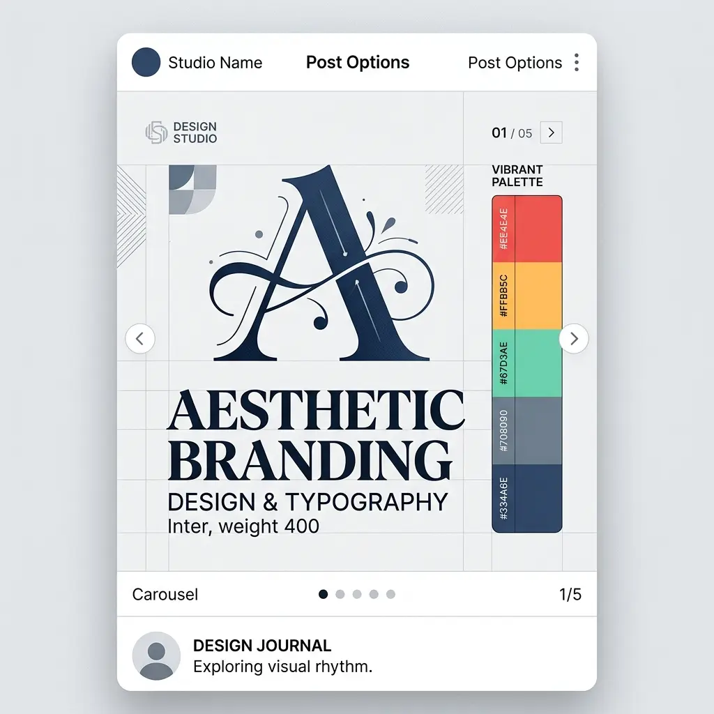
Never use more than two fonts in a single carousel. Pair a bold, attention-grabbing display font for your headlines with a clean, highly legible sans-serif font for your body text. For example, pairing Playfair Display (for elegance) with Inter (for readability) creates a stunning contrast that looks professional and modern.
2. Embrace Negative Space
Do not cram your text. Leave plenty of "breathing room" (negative space) around your typography. This not only makes the text easier to read but also makes your design look premium. A cluttered slide screams amateur; a spacious slide commands authority.
Color Psychology: Evoking the Right Emotion
Colors do not just make your carousel look pretty; they communicate subconscious messages to your audience. The colors you choose must align with the emotion you want your content to evoke.
1. Contrast is King
Your text must have high contrast against the background. If you are using a dark background, use pure white or light pastel text. If you are using a vibrant background, use dark text. Low contrast causes eye strain, and users will immediately swipe past your post if it is hard to read.
2. Stick to a Defined Palette
A cohesive brand identity requires consistency. Choose a primary color, a secondary color, and an accent color. Use the accent color sparingly—only for highlighting key words or pointing to your call-to-action. This creates a visual hierarchy that naturally directs the reader's attention to the most important parts of your message.
Conclusion
Great design is invisible; it simply makes the content feel "right." By limiting your fonts, maximizing contrast, and utilizing negative space, your carousels will stop looking like amateur graphics and start looking like premium brand assets. Start experimenting with these principles today and watch your engagement metrics soar.