The First Slide Decides Everything: How to Hook Carousel Viewers Instantly
I spent three months posting carousels that got 40–60 likes each. Same design quality, same advice, same effort. Then I changed one thing — the first slide — and my next post hit 1,200 likes and 300+ saves.
The difference wasn't the content inside. It was the door I was asking people to walk through.
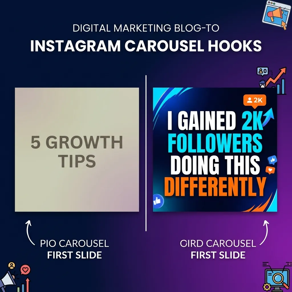
Most creators treat the first slide like a table of contents page. "5 Tips for Better Content." "How I Grew My Account." That works in a PDF nobody asked for. But on a feed where you're competing with Reels, memes, and someone's vacation photos, a label isn't enough. Your first slide needs to work like a highway billboard — you have about 1.5 seconds before the thumb keeps moving.
Here's how to make those 1.5 seconds count.
The Three Hook Types That Consistently Work
After testing over 200 carousel first slides across different niches, I've found three hook structures that outperform everything else.
1. The Bold, Specific Claim
"I gained 4,000 followers in 30 days using one content format." This works because it's concrete. There's a number, a timeframe, and a promise. Compare it to "How to Grow on Instagram" — which says nothing and promises even less.
More examples that perform:
- "I tripled my save rate by removing one element from my carousels."
- "This posting schedule got me 100K impressions in a week."
- "One caption change. 5x more comments. Here's what I did."
2. The Curiosity Gap
"The posting strategy nobody talks about (because it's boring)." You create an itch that only swiping can scratch. The reader needs to know what the boring strategy is. That's the gap.
Variations:
- "The slide most creators skip is the one that drives saves."
- "I stopped doing this and my engagement doubled."
- "There's a reason your carousels aren't getting shared."
3. The Relatable Frustration
"You're not bad at content. You're just posting at the wrong time." This validates the reader's struggle and positions you as someone who gets it.
More examples:
- "You don't need more followers. You need better first slides."
- "Your content isn't the problem. Your hook is."
- "Spending 3 hours on a carousel that gets 12 likes? Read this."
First-Slide Design: What Actually Stops the Scroll
The hook isn't just about words. The visual design of your first slide matters just as much.
High contrast wins. Dark backgrounds with bright text outperform pastel-on-pastel almost every time. Your slide needs to pop on a phone screen at 50% brightness while someone scrolls in bed. If you squint, they'll just keep scrolling.
One font. Bold. Big. The best-performing first slides I've analyzed use a single bold font at a large size. No decorative scripts, no thin weights, no font mixing. Just one strong statement that fills the frame.
Remove everything unnecessary. Profile handles, logos, episode numbers, "swipe →" arrows — all of this dilutes the hook. On slide one, every pixel should serve the hook. Everything else goes on slides 2–10.
Use visual hierarchy intentionally. If your hook is two lines, make the second line noticeably larger or a different color. "Most creators make this mistake" (small, muted) → "IT'S KILLING YOUR REACH" (large, bright). The contrast between the two lines creates its own curiosity gap.
The First-Slide Mistakes I See Every Week
Mistake 1: Using a title instead of a hook. "Social Media Tips" isn't a hook. "The social media tip that made me $4,000 last month" is. The first one is a category. The second one is a story with stakes.
Mistake 2: Too many words. If your first slide has more than 12–15 words, you're asking people to read before they've decided to care. Cut it down. Be ruthless.
Mistake 3: No emotional charge. The best hooks trigger a specific emotion: curiosity, frustration, surprise, validation. "Content Marketing Guide" triggers nothing. "I deleted 6 months of content and it was the best decision I ever made" triggers curiosity and surprise simultaneously.
Mistake 4: Designing for desktop. Your slides will be viewed on a phone held at arm's length, probably while the person is doing something else. If your text isn't readable at a glance on a 6-inch screen, it doesn't exist.
Mistake 5: Being too clever. Wordplay and metaphors can work, but only if the meaning is instantly clear. If someone has to think about what your first slide means, they won't. They'll scroll past instead.
How to Test Your First Slides
Here's a framework I use before publishing any carousel:
The 3-Second Test. Show the first slide to someone who isn't in your niche. Give them 3 seconds. Then ask: "Would you swipe?" If they hesitate, rewrite the hook.
The Scroll Test. Put your slide in context. Screenshot it, paste it between other posts in a mock feed. Does it stand out? Or does it blend into the noise?
The Screenshot Test. Would someone screenshot just this slide and send it to a friend? If the first slide alone isn't share-worthy, it's not hook-worthy either.
The "So What?" Test. Read your first slide out loud and ask "so what?" after it. If you can't immediately answer why someone should care, the hook isn't specific enough. Add a number, a result, a timeframe, or a personal detail.
The Uncomfortable Math
Here's the part nobody talks about: most people who see your carousel will never swipe. Even on a well-performing post, the majority of your audience interacts with slide one and only slide one. That means your first slide IS the content for most of your reach.
Treat it that way. Spend more time on slide one than on slides two through ten combined. That ratio sounds extreme. It's not. The best creators I know have a folder full of rejected first slides for every carousel they publish. They write five or six versions, pick the strongest one, and delete the rest.
Your content behind the first slide might be brilliant. But if the door doesn't open, nobody walks through.
Fix the first slide. Watch everything else follow.