Photos vs Graphics in Social Media Carousels: What Converts Better?
When designing a social media carousel, one of the most fundamental decisions you have to make is your visual style: should you rely on realistic photography, or should you lean into colorful vector graphics and illustrations?
This debate has raged on among marketers for years. Some argue that human faces and authentic photos build trust faster, while others claim that clean graphics and charts are superior for explaining complex information.
In 2026, with the rise of AI-generated imagery and advanced design tools, both options are more accessible than ever. But which one actually converts better? Let’s break down the strengths, weaknesses, and best use cases for both photos and graphics in your carousel strategy.
The Case for Realistic Photography
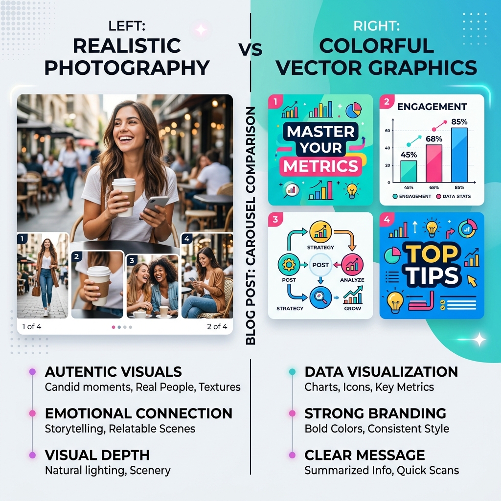
Photography—whether it’s high-quality stock, candid team shots, or AI-generated realism—brings an undeniable human element to your content.
Strengths:
- Emotional Connection: Humans are biologically hardwired to respond to faces. A photo of a person expressing an emotion (frustration, joy, surprise) immediately translates that feeling to the viewer, establishing empathy before they even read the text.
- Authenticity: In an era saturated with synthetic content, real, unpolished photos of your workspace, your team, or your product in use can serve as a powerful differentiator. It proves you are a real entity.
- Aspirational Lifestyle: If you are selling a lifestyle, coaching, or physical products, photography is non-negotiable. Viewers need to project themselves into the scenario you are depicting.
When to Use Photography:
- Personal branding and storytelling.
- Behind-the-scenes content or "Day in the Life" posts.
- Product demonstrations and e-commerce.
- When sharing personal milestones or vulnerable stories.
The Case for Vector Graphics and Illustrations
Graphics, charts, and illustrations offer a level of clarity and control that photography simply cannot match.
Strengths:
- Data Visualization: If your carousel relies on statistics, frameworks, or step-by-step processes, graphics are essential. A well-designed chart or infographic is infinitely easier to understand than a paragraph of text describing the same data.
- Brand Consistency: Vector graphics allow for absolute adherence to your brand guidelines. You can ensure every icon, background, and accent color perfectly matches your hex codes, creating a highly cohesive and recognizable feed.
- Abstract Concepts: How do you photograph "cloud computing architecture" or "the psychology of pricing"? You can't. Graphics excel at making intangible, abstract concepts concrete and understandable.
When to Use Graphics:
- B2B educational content and "How-to" guides.
- Sharing industry statistics, survey results, or case study metrics.
- Explaining complex frameworks or technical processes.
- Listicle formats (e.g., "5 Tools to Boost Productivity").
Design Professional Carousels in Seconds
Stop wasting hours on complex design tools. Slidy Creator turns your text into stunning, high-converting social media carousels and presentations instantly. Stand out in the feed with premium templates and AI-driven layouts.
The Hybrid Approach: The Ultimate Winner
So, which one converts better? The data shows that the answer is rarely a strict "either/or." The highest converting carousels in 2026 often utilize a strategic hybrid approach.
How to Mix Photos and Graphics Effectively:
- The Human Hook: Use a striking, realistic photograph on the first slide (the hook) to grab attention and establish an emotional connection. Once the user swipes, transition to clean graphics and charts to deliver the educational value efficiently.
- Annotated Reality: Take a real photograph of a workspace or product, and overlay clean, branded vector UI elements, arrows, and text boxes pointing out specific features.
- Consistent Framing: If you use photos, place them inside consistent graphical frames or shapes (like circles, arches, or rounded rectangles) that match your brand colors. This unifies the chaotic nature of photography with the structural order of graphics.
Platform Context Matters
It's also crucial to remember that different platforms favor different styles.
- LinkedIn audiences respond exceptionally well to data-heavy graphics, clean typography, and professional frameworks.
- Instagram audiences generally prefer high-aesthetic photography, lifestyle imagery, and relatable human faces.
Conclusion
Stop viewing photos and graphics as opposing forces. They are simply different tools in your visual communication toolkit. Use photography to evoke emotion and build trust, and use graphics to clarify data and explain complex ideas. By mastering both, and knowing when to deploy them, you can create carousels that not only look stunning but drive serious conversions.