I Reverse-Engineered 50 Viral Posts — Here's What They All Have in Common
Last month I did something slightly obsessive. I screenshotted 50 Instagram posts with over 1 million impressions — across fitness, business, design, self-improvement, and marketing. Not from celebrity accounts or meme pages. From regular creators with followings between 10K and 500K.
I wasn't looking at surface-level stuff like "they used trending audio" or "they posted on Tuesday." I was looking for structural patterns. What do these posts have in common underneath the content? What makes the architecture of a viral post different from a post that dies?
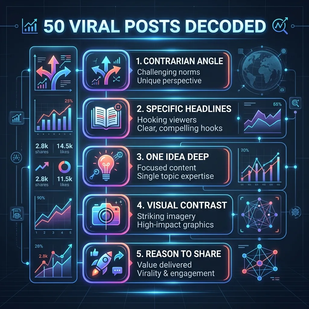
Five patterns emerged. And they were so consistent that once you see them, you can't unsee them.
Pattern 1: Contrarian or Counterintuitive Angle
"Stop posting Reels" — from a Reels expert. "Don't niche down" — from a branding coach. "Hashtags are dead" — from someone who built an audience using hashtags.
Of the 50 posts I analyzed, 23 led with a take that contradicted conventional wisdom in their niche. That's nearly half.
Why this works: contrarian content generates engagement from both sides. People who agree feel validated and comment to say so. People who disagree feel compelled to argue. Both reactions drive the post into more feeds. The algorithm doesn't care whether people agree with you — it cares whether people engage.
How to apply this: Take a piece of standard advice in your niche. Ask yourself: "Is this actually true in my experience?" If the answer is "not exactly" or "it depends," you have a contrarian post. The key is backing your take with personal experience or data. "Hashtags don't work" is a hot take. "I removed hashtags from my last 30 posts and my reach went up 15% — here's why I think that happened" is a contrarian insight with receipts.
Common mistake: Being contrarian without substance. If you just disagree to get attention but have no argument behind it, you'll get engagement but lose trust. Every contrarian post needs evidence.
Pattern 2: Ultra-Specific Headlines
"How I made $4,200 from one Instagram carousel" hit 2.3 million impressions. "How to make money on Instagram" would've hit 2,300.
The difference? Specificity. Specific numbers, specific formats, specific outcomes. The first headline feels real. It has texture. It implies this actually happened to a real person. The second headline could have been written by anyone about anything.
More examples from the 50-post analysis:
- "I gained 12K followers in 6 weeks using only carousels" (1.4M impressions)
- "The 20-minute morning routine that changed my content output" (1.1M impressions)
- "I tested 5 posting times for 90 days. Here's the data." (2.1M impressions)
How to apply this: Before you write your headline, ask: "Can I add a number?" and "Can I make this more specific?" Replace "How to grow" with "How I grew from 800 to 15K in 4 months." Replace "Content tips" with "3 content changes that tripled my saves."
Pattern 3: One Idea, Deep
None of the 50 viral posts tried to cover 10 things. They covered one thing well. One framework. One story. One mistake. One experiment.
This is counterintuitive because it feels like "more tips = more value." But that's not how content consumption works on Instagram. People are scrolling quickly. They can absorb and remember one strong idea. They can't absorb ten.
A carousel about "The one posting mistake that's killing your reach" with 10 detailed slides about that single mistake will dramatically outperform "10 mistakes you're making on Instagram" with one slide each. The first one creates depth. The second creates surface.
How to apply this: When you outline a post, check your core message count. If you have more than one central idea, split the post into two or more separate posts. Each post, each carousel, each Reel should answer one question comprehensively.
Pattern 4: Strong Visual Contrast
In the carousels that broke out, visual design wasn't an afterthought. It was a weapon.
Common visual traits across the top-performing posts:
- Bold text on clean backgrounds. No clutter. No texture. Just message and space.
- One font maximum. Two at the absolute most. Font mixing is the visual equivalent of trying to make too many points in one post.
- High color contrast. Dark backgrounds with light text, or vice versa. Nothing pastel-on-pastel. Nothing that requires squinting.
- Minimal branding on content slides. Logos and handles on the last slide, not splattered across every frame.
The posts that looked the most "designed" often performed the worst. The ones that looked clean and readable — almost brutally simple — performed the best.
How to apply this: Strip your carousel design back to essentials. One font. Two colors. One idea per slide. If something isn't serving the message, remove it. Design for a phone screen held at arm's length, not a desktop monitor viewed up close.
Pattern 5: A Reason to Share
This was the most interesting pattern and the hardest to quantify. Every viral post gave the viewer a specific emotional reason to share it. Not just "this is good" — but a specific sharing impulse.
The three sharing impulses I identified:
"This makes me look smart." Sharing content that demonstrates taste or knowledge. "This is gold — everyone needs to see this." The sharer gets social capital for discovering and curating quality content.
"I feel seen." Sharing content that articulates something the viewer has been thinking but couldn't express. "This is exactly what I've been saying." The share is an act of self-expression.
"This is useful for someone I know." Sharing content as a gift. "My team needs to see this" or "Sending this to every creator I know." The content has practical value beyond the individual.
How to apply this: Before you publish, ask: "Why would someone share this with a friend?" If you can't articulate a clear reason, the post isn't share-ready. Add a personal angle for the "I feel seen" impulse, make it more tactical for the "useful gift" impulse, or make the insight more surprising for the "makes me look smart" impulse.
How to Reverse-Engineer Viral Posts Yourself
You don't have to analyze 50 posts. Here's a quick method you can use weekly:
Step 1: Find 3 posts in your niche that got disproportionate reach (look at the Explore page, or check accounts you admire).
Step 2: For each post, answer: What's the hook? What emotional response does it trigger? What's the structure? What's the visual approach? Why would someone share this?
Step 3: Write down the patterns you see. After a month of doing this, you'll have your own playbook of what works in your specific niche.
Step 4: Apply one pattern to your next post. Not all five at once. One at a time. Test, measure, iterate.
The Mistake People Make When Studying Viral Content
The biggest trap: copying the surface instead of the structure. If someone's carousel went viral with a yellow background and a specific font, the lesson isn't "use yellow and that font." The lesson is in the hook, the structure, the emotional trigger, and the shareability.
Copy the architecture. Make the content your own. The creators who go viral consistently are the ones who understood the patterns and applied them through their own voice — not the ones who cloned someone else's aesthetic.
Study what works. Then make it yours.